

My name's Ricky.
I design and code.
Let's build something incredible.
View Source on GitHubConnect on LinkedIn


I was one of the main designers for the Intuit homepage, intuit.com, from 2010 to 2014. I worked on both the mobile and desktop sites extensively, though the projects I'm sharing here are ones where I led the design efforts.
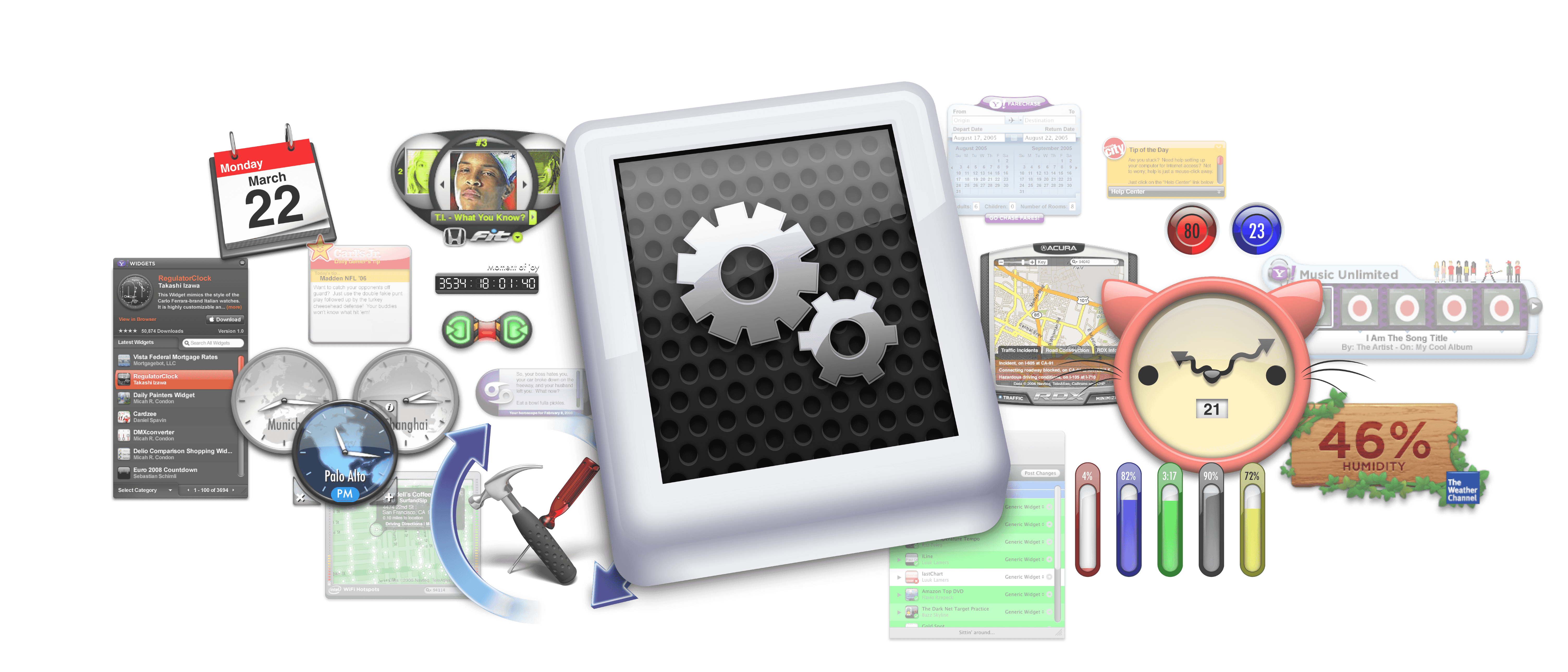
In 2010, Intuit was starting to get serious about mobile, and wanted to test building out a dedicated mobile site (back when those were a thing) at m.intuit.com. One of our team's lead visual designers had produced an early version of the mobile site, but at first it mainly served as a test to see if it would get any traffic (which it did).
I came on to flesh out some of the pages, as well as to design some completely new ones. One of these new pages was about Intuit's ecosystem and community efforts. It would highlight Intuit products with mobile features, talk about the corporate blog, and detail the company's "Love a Local Business" initiative where small businesses could compete for grants from Intuit.
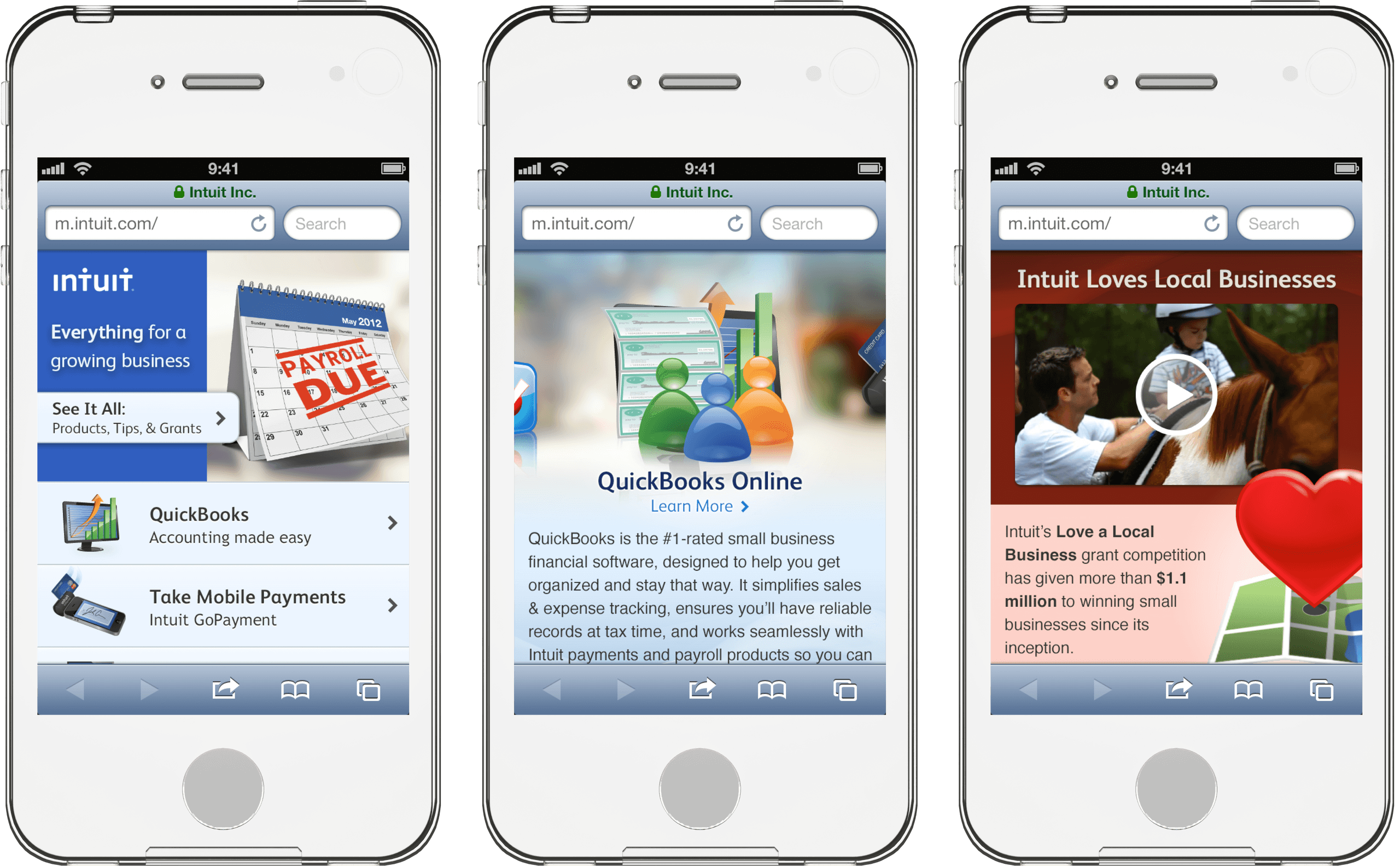
When I designed these pages in 2012, the UI aesthetic on phones was quite different to today's. Apps tended to use lots of gradients, along with glossy and textured materials. At the time, I felt it was important for Intuit's first mobile site to reflect these trends so that it would feel as though it was designed specifically for your device.
I was also obsessed with mobile best practices, like being selective and intentional about the information onscreen, and sizing tap targets appropriately. I took this so seriously that I would regularly correct my colleagues to say "tap," "touch," or "press" instead of "clicking" on things in a touchscreen design.
Since screen space is always at a premium on a smartphone, I decided to have elements on the page "peek" from the edge of the screen or container. I used this affordance a lot to tell users they could scroll, swipe, or rotate the device to see more.

Our dedicated mobile site helped prove that mobile was something that the marketing and product teams should pay attention to. Of course, this is obvious in hindsight, but wasn't at the time.
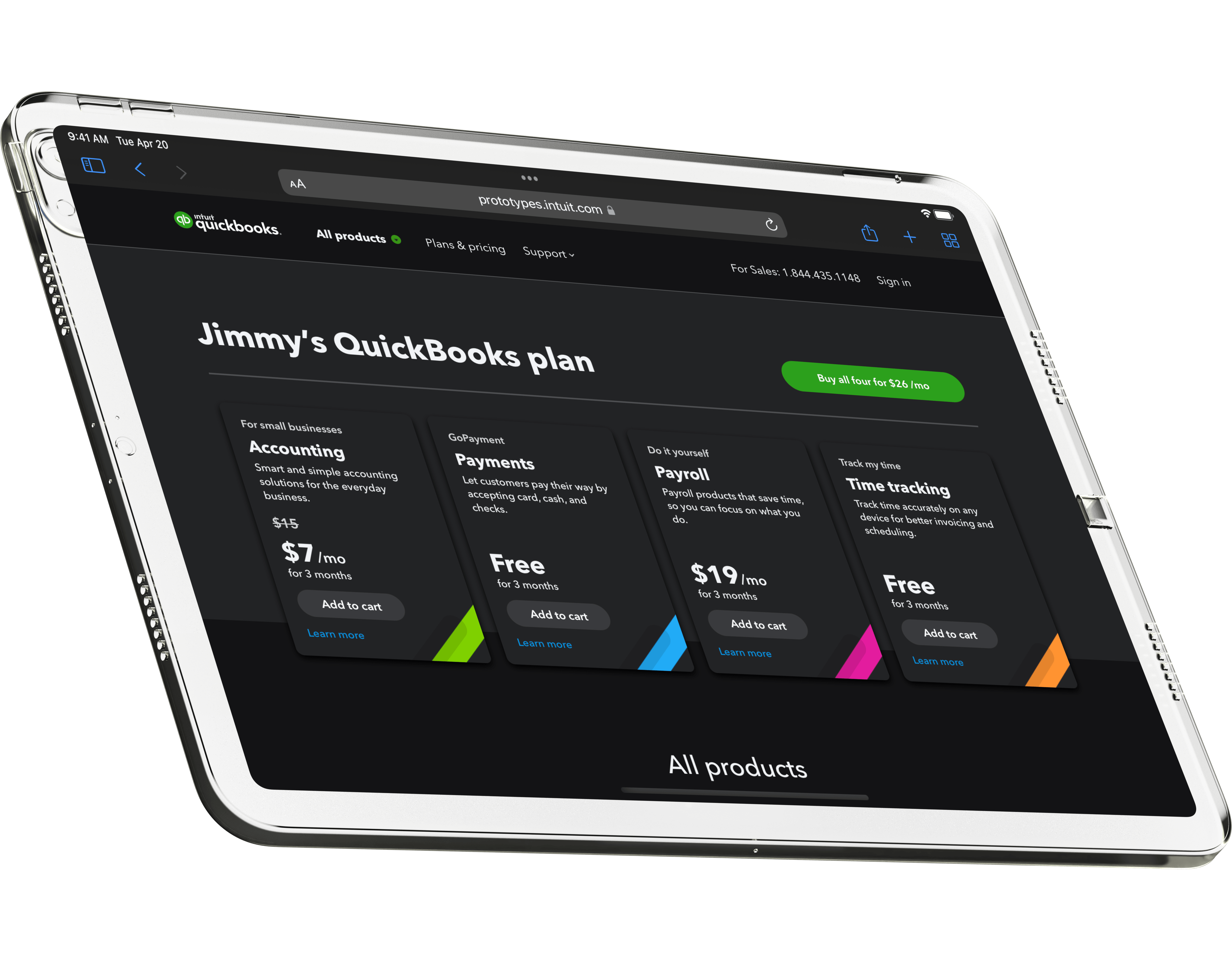
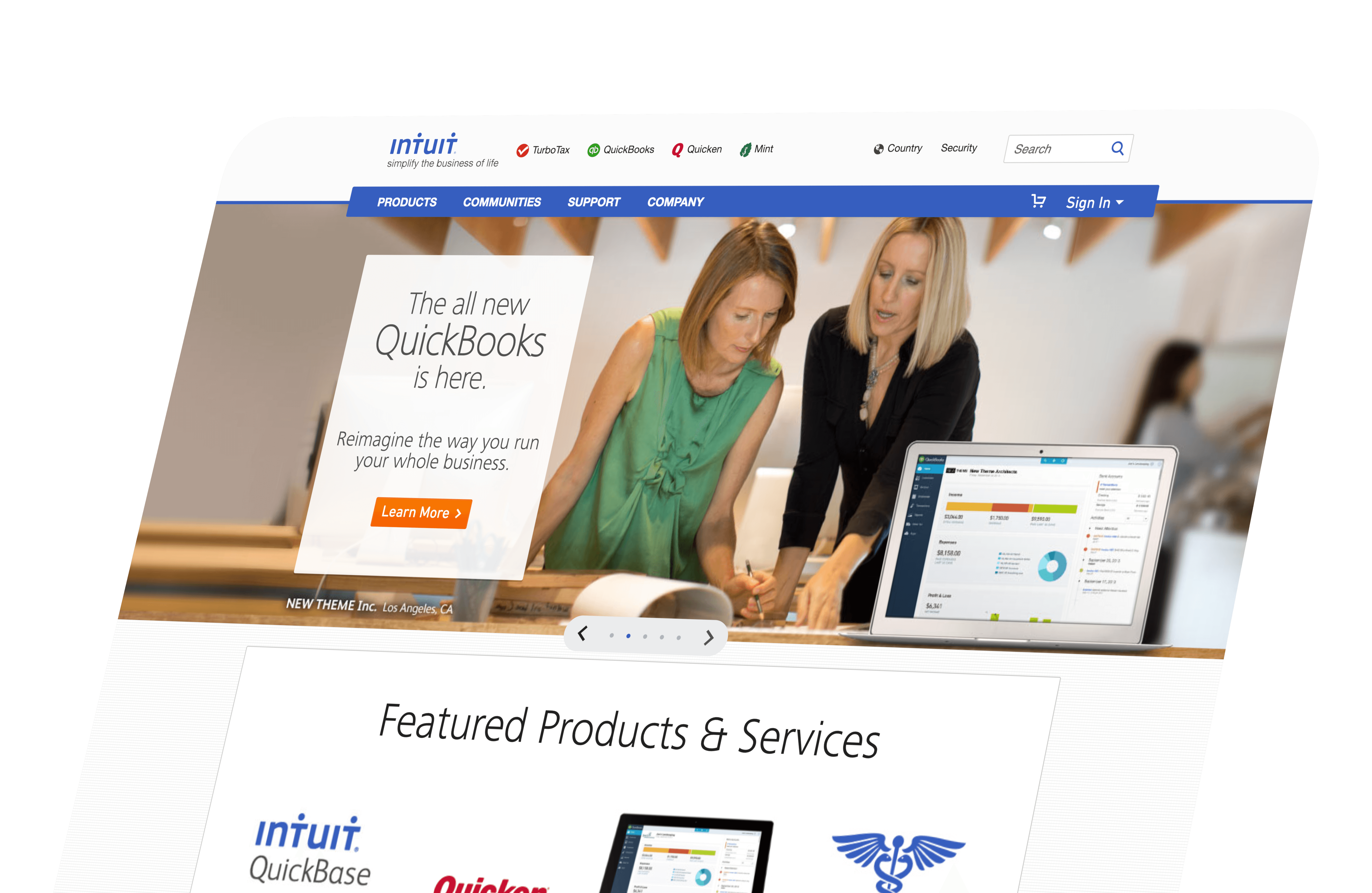
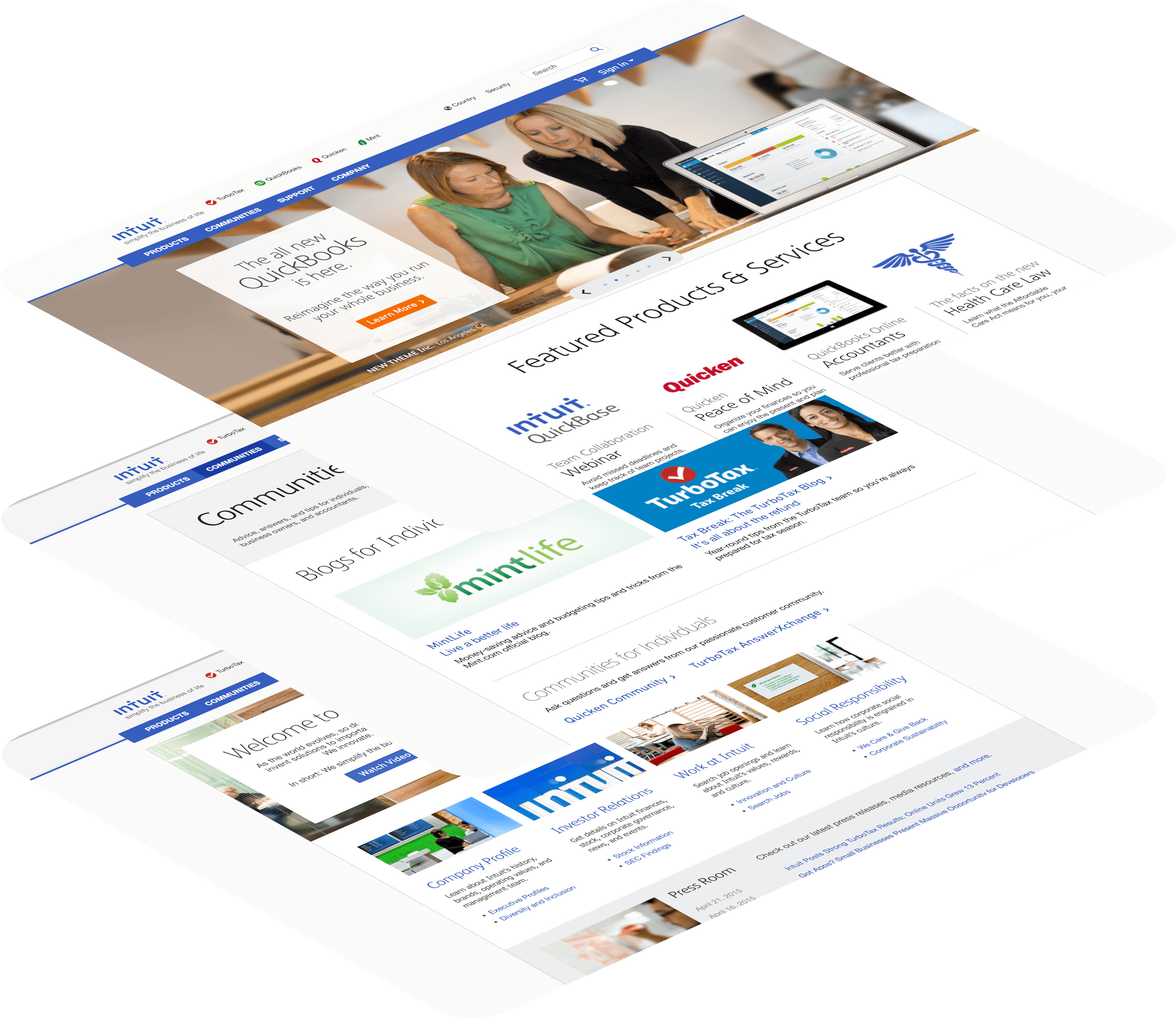
Following a large redesign to the marketing pages for Intuit's small business offerings, in 2013 I was tapped to overhaul the design and information architecture for Intuit's homepage and related pages. In the redesign, we planned to introduce ecosystem and community themes throughout, and help people more easily find what they need. We also wanted to leverage our design team's work on the new design system, called Harmony.
I pushed hard for designs where the navbar was two lines high, since navigation starts looking really cluttered at three lines. This was a hard challenge because we had some new branding constraints to address. It's easy to go overboard with the number of links at the top of the page, so I pressed the team to be intentional and choose only the most important links for the header.
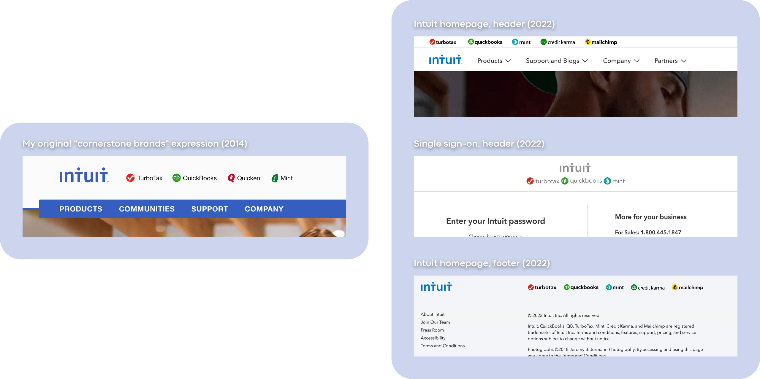
Intuit was also in the middle of transforming its brand strategy to a "branded house." This meant that we had to tie our cornerstone products to the Intuit brand to increase the parent brand's recognition. (People knew TurboTax, but not Intuit.) I solved this in an elegant way by simply including favicon-sized icons in the header alongside the product name, and aligning them next to the Intuit logo. It looks a bit different today, but this brand expression endures at Intuit 8 years later.
I also planned to make this a responsive webpage. At the time, responsive design was a pretty new practice, though it had a lot of promise. I wanted to make sure the new homepage would scale and adapt to whatever device you happened to visit on.
Brad Smith, who was our CEO at the time, presented these Intuit homepage changes at the company's 2013 Leadership Conference.
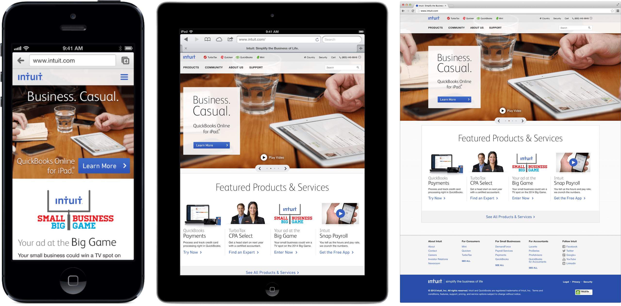
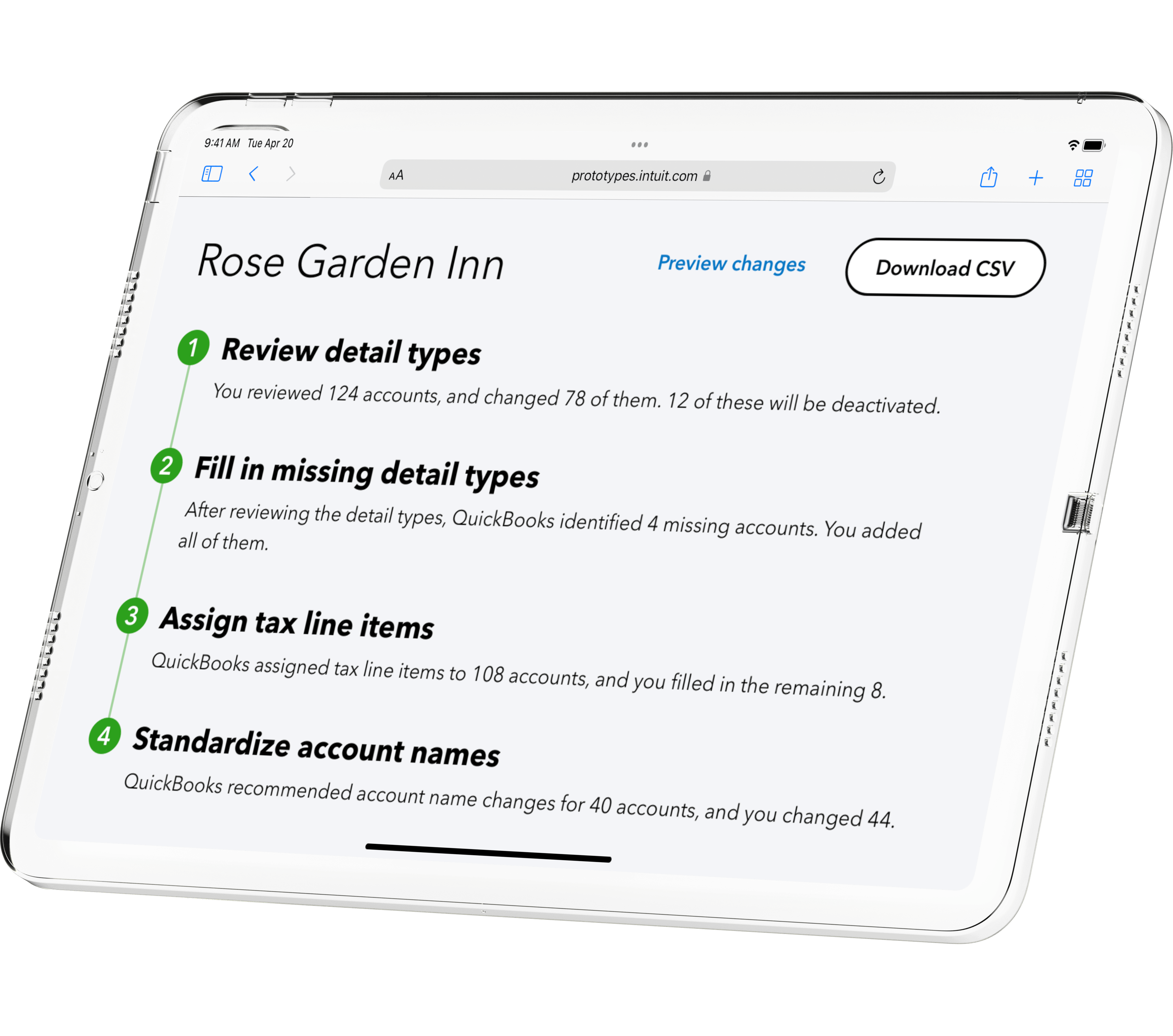
After this, I started fleshing out the rest of the site. We wanted people to be able to browse all of Intuit's products – not just the cornerstone ones – so I designed a page where we could list those out in exhaustive detail. This also partly served as a concession, since my homepage design had no space for the SEO "content" from the previous design. However, by surfacing our lesser-known products for our human visitors, this served as an improvement to the approach we were using before.
I carried through some of my previous work on the Intuit mobile site to bring community aspects to intuit.com. We added links to user forums and blog content for our various products in a dedicated section on the site.
Our "About" page also got an overhaul to match the rest of the site, making it feel much more modern than its original look.
The redesign resulted in a 39% increase in clickthrough rate, and a 37% decrease in bounce rate. This indicated that we achieved our goal of helping people find what they needed more easily.
This period in my design career taught me a lot about how to effectively design sites for smaller touchscreen devices. I learned how to articulate design intent, defend my designs under pressure, and work with stakeholders to adapt designs while maintaining a strong, user-centric point of view. Plus, my technical expertise guaranteed that the pages would load quickly and look great. If those sound like things your design team values, please get in touch!


I'm a designer and engineer in the scenic Bay Area of California. I've worked in web design and development (mobile and desktop) for over 15 years, and I'm dipping my toes in Swift and WebGL now. I've designed for both product and marketing teams, and done both visual and interaction design. I've also written product and marketing code for use in production.
I've produced my best work in roles leveraging both my design and engineering talents. However, I can specialize in design only when needed.
In my spare time I like to take photos, build small hobby projects, and play video games (Nintendo for life).
What do you want to build together?
I want to hear about it. Drop me a line.