
QuickBooks: Dark Mode
At the end of 2018, UI customization started hitting the mainstream. Apple launched macOS Mojave at the end of the year with a system-wide dark mode. Rumors had it that iOS 13 would follow suit in 2019 (and it did). The QuickBooks design team had explored dark mode before in bits and pieces, but never at scale. So, in the spring of 2019, before iOS 13 launched, I started thinking about how this accessibility mode might apply to QuickBooks.
I consider this an accessibility mode because, like high-contrast mode, it makes products usable for more people. For example, my partner Heather suffers from chronic photosensitive migraines. Today, she uses dark mode on all her devices in part because of that.
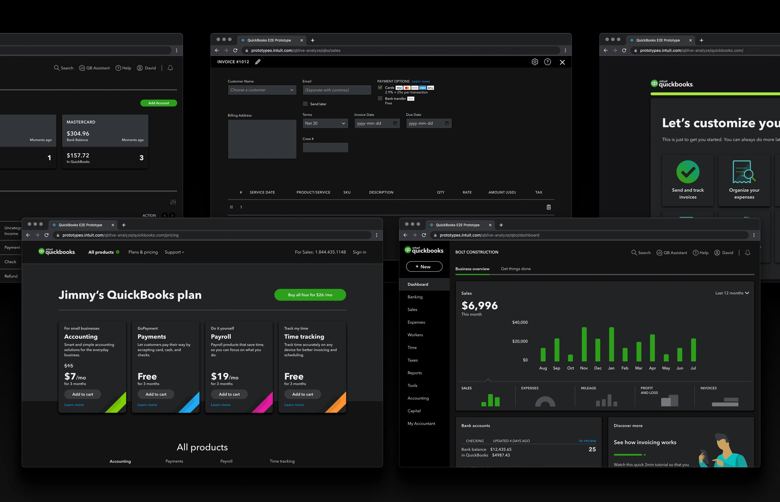
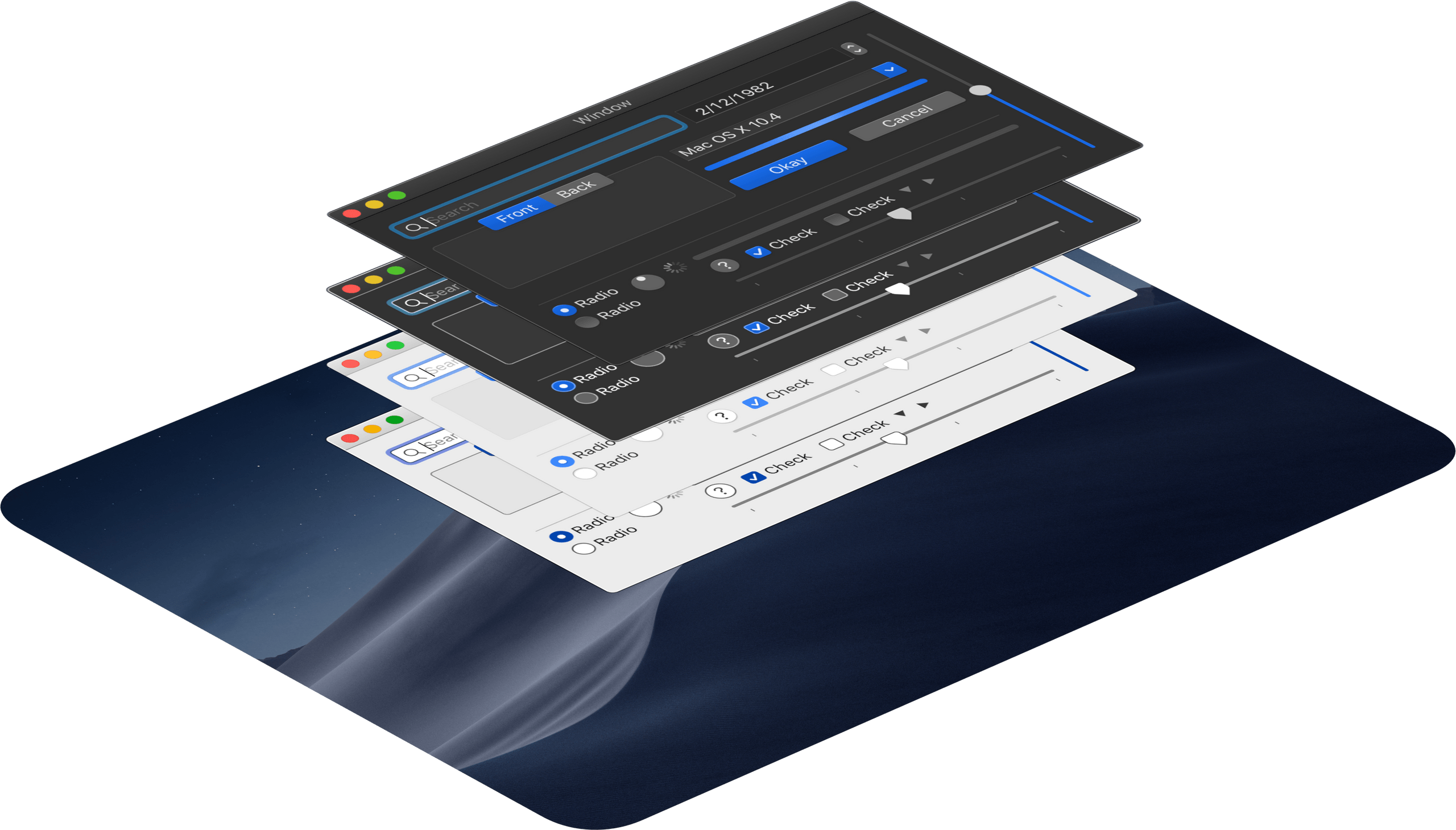
Before this, our prototyping team at Intuit built something we called the end-to-end prototype. It sat outside of production so we could test and iterate quickly. We meant it to represent many screens in the user's experience of signing up for and using QuickBooks, and we frequently used it to try out new UI concepts. This turned out to be a great proving ground for my dark mode concept.
I started by deconstructing how Apple applied dark mode to macOS. By exploring different palettes and UI elements, I immediately learned that it wasn't a simple inversion. We couldn't simply plop filter: invert(100%) on the body element and call it a day. Everything needed consideration, from how background layers interact, to how hover states and shadows work. I also explored how high contrast mode interacts with dark mode in the OS.
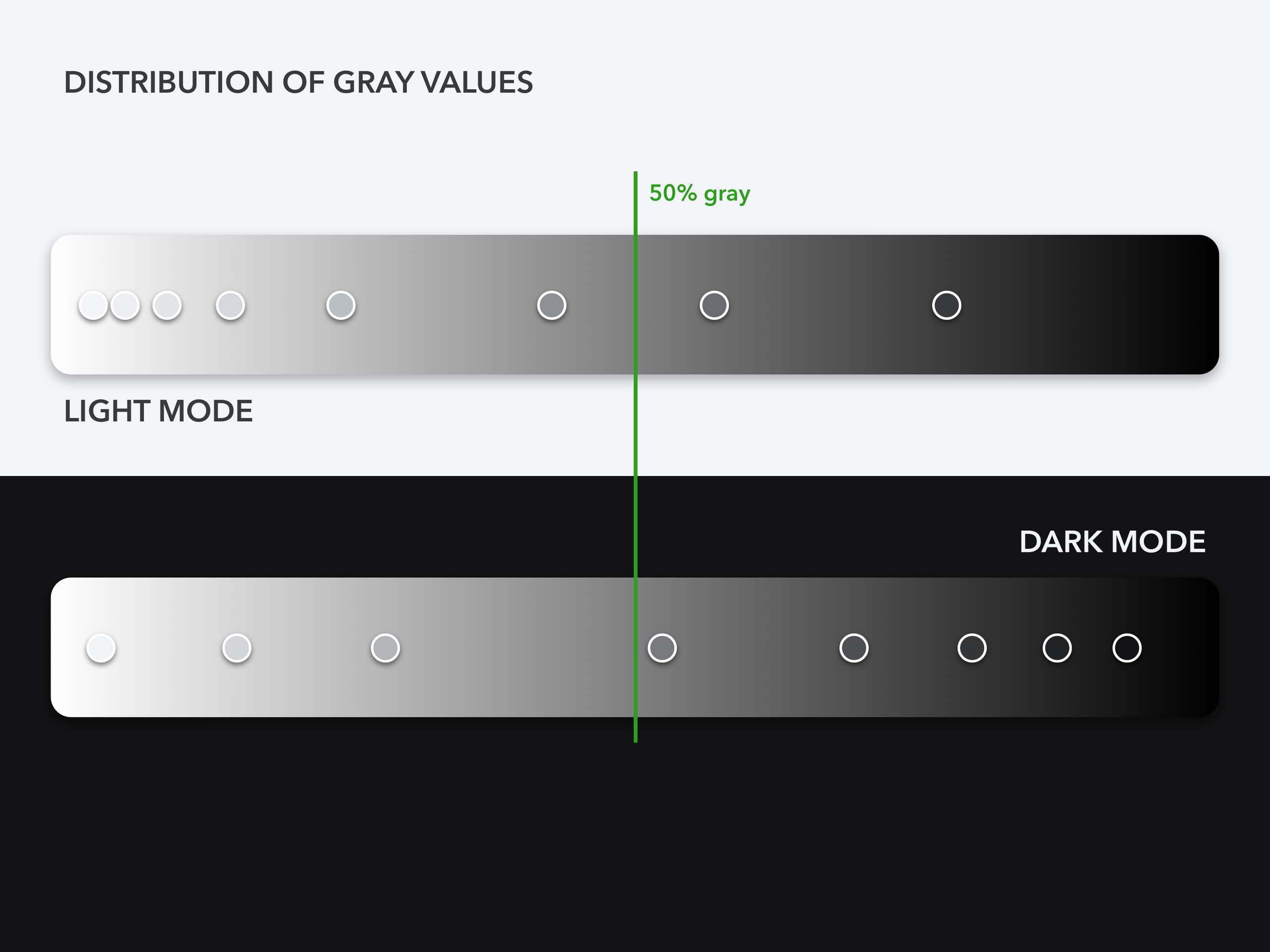
The main thing I took away from my reverse engineering is that turning on dark mode is like turning the lights off. Light and dark things darken, but light things stay lighter. The grays in our light mode palette weren't up to this task for dark mode because most of the grays were over 50% brightness. So, consulting with our design system lead, I built a new gray palette just for dark mode.
As I worked on the prototype, I documented high-level rules to define how light mode designs adapt to dark mode in the QuickBooks Design System.

In under a month, I converted all the screens in our prototype to dark mode. And because I did this using CSS custom properties, I could also make a high-contrast mode and colorblind mode. I did this to show how the various modes could combine. I consulted with our design team's accessibility expert to fine-tune these.
The next challenge was applying this in production. QuickBooks is a big app composed of plugins managed by many different engineering teams. We needed a way to launch this feature without going into the code of every single plugin and releasing a new version.
The solution I developed was an automated conversion tool which would pull the CSS for every plugin, then run heuristics on that code to derive a dark mode version. Leveraging some prior CSS cleanup tooling, it looks at the context of each CSS color, modifying the colors depending on that context. Then it builds an overlay stylesheet which applies the colors to the page. From there, we use a few manual overrides, and apply the stylesheet using a plugin that one of my design technologist colleagues created. I partnered with the shell team – the team responsible for the core of QuickBooks's architecture – to guarantee that the plugin wouldn't impact performance for customers who didn't use it.
Dark mode launched in QuickBooks Labs for user testing in 2020. Intuit recognized my efforts by honoring me as a Level 2 Accessibility Champion.
This is one of many contributions I made to Intuit's design systems. I can design and develop your company's design system too; drop me a line!